Amidst the ongoing digital revolution, the mobile skin template has surfaced as an indispensable instrument for augmenting the overall user experience. It dictates the aesthetics and functionality of a mobile application by serving as a blueprint for its visual components.
It is impossible to exaggerate the significance of a mobile skin vector template in the mobile-centric world of today. It promotes design uniformity across various displays, thereby enhancing the overall user experience. This holds notable importance in light of the wide array of mobile devices presently accessible.
In addition, an effectively developed mobile skin vector template has the potential to greatly enhance user engagement. It can increase the popularity and success of an application by rendering it more user-friendly and intuitive. Fundamentally, a mobile skin template is an indispensable element in the development of a prosperous mobile application within the current digital environment.
This blog will guide you through the tips for getting the most out of your mobile skin template. Let’s dive in.
1 # Understanding Your Audience
Keep your target market in mind while you create the skin for your mobile app. The vector templates for mobile are the first impression of your app. Focus on what the target demographic enjoys and expects from your design.
You can tailor the layout, colour scheme, font, and features of a mobile skin template to a specific demographic by first learning about them. While the older demographic prefers clean, straightforward layouts with larger fonts, the younger demographic is more interested in unique features and eye-catching hues.
When creating mobile skins, it’s important to take the culture of the target audience into account to prevent misunderstandings and offences.
The level of complexity of your mobile skin vector template is also influenced by the visitors’ level of technical expertise. Techies may want a lot of customisation options and features, but regular people might be happier with a straightforward design.
2 # Simplicity is Key in Mobile Skin Template
The idea of simplicity holds great significance in the field of mobile design. A mobile interface needs to be simple to use, easy to navigate, and cleanly designed. Complicating matters can lead to a bad experience for the user as a whole, misunderstanding, and dissatisfaction. Designers can guarantee that users can interact with the interface with ease, get the information they need fast, and finish jobs swiftly by maintaining simplicity.
This increases engagement and retention rates while also improving customer happiness. It’s critical to remember that consumers are inundated with options and information in today’s fast-paced digital world. As a result, minimalism is the ultimate form of sophistication.
3 # Color Scheme
For a mobile skin template, selecting the appropriate colour scheme is essential. In order to create a recognisable and consistent aesthetic, it should be in line with the brand’s identity.
Given that colours can elicit feelings and perceptions, it’s critical to comprehend colour psychology. For example, green might stand for growth and freshness, while blue frequently denotes trustworthiness and dependability.
Another important component is readability. A high contrast between the background and the text makes the material easier to read and ensures that people can grasp it.
Finally, think about accessibility. A colour scheme should be inclusive, taking into account people who have colour vision impairments. In this sense, tools such as contrast checkers can be helpful.
Recall that a thoughtful colour scheme enhances readability and brand recognition, which not only makes your mobile vector skin template more visually appealing but also improves user experience.
4 # Typography
A mobile skin template is only as good as its typography. If you choose the proper font and size, you can greatly improve both readability and visual appeal.
Pick a typeface that reflects the values of your company. An IT company might do well with a contemporary sans-serif typeface, while a legal office might do well with a classic serif font.
Readability issues arise when text is too small. The ideal point size for body text is anywhere between 12 and 16 points. However, keep in mind the preferences of your readers. The higher text size, for instance, may appeal to an older audience.
Think about the size of the fonts, too. For emphasis, choose a bold typeface, whereas ordinary or light fonts are best for the body of the text.
Typography is more than just picking a pretty font, so keep that in mind. It’s about finding that sweet spot where user experience improves, and your brand’s message is clearly conveyed.
5 # Optimising Images
Images optimised for a mobile skin template must strike a compromise between high quality and quick loading times.
- It all starts with picking the correct file type. JPEGs are fantastic for pictures, whereas PNGs are better for images containing text or sharp lines.
- Second, adjust the size of the photographs so they fit the display. Websites with lots of large photos may be slow to load. To make sure photos scale and resize properly across devices, use CSS.
- Third, a compression tool can be used to shrink files without compromising quality. TinyPNG and JPEGmini are two powerful image compression tools.
- At last, make use of slow loading. This method reduces the time it takes for a page to load by only loading the images when they are needed.
Keep in mind that optimised graphics not only save bandwidth for mobile users but also enhance the user experience by reducing load times.
6 # Navigation
It is extremely important for a Mobile skin vector template to have navigation that is both easy to use and well-designed.
- Keep things straightforward. Users may become frustrated with overly complex menus. Use standard layouts like hamburger menus and footer links.
- Be consistent; that’s the second point. The position of the menu should be consistent across all pages.
- Thirdly, understandable packaging. There shouldn’t be any explanation needed for how to use the menus.
- Lastly, consider thumb-friendly zones. When designing for mobile, it’s important to provide important functionality where the thumb naturally rests.
Always keep in mind that happy users are the result of well-designed navigation.
7 # Responsive Design
A responsive design is essential for mobile skin templates.
- It assures accessibility first. People use webpages on devices with varied screen sizes and orientations. A responsive design makes these changes seamless.
- Second, usability improves. Elements change to screen size for easier interaction.
- Third, it improves readability. Text and graphics scale properly, making content easy to read without zooming or scrolling.
- Finally, it improves SEO. Mobile sites rank higher in search engines, increasing traffic.
In essence, a responsive design optimises user experience across devices, not just screen sizes.
8 # Testing Across Different Devices
A consistent user experience requires testing a mobile skin vector template across devices.
- First, it finds device-specific faults. Content displays differently on different devices.
- It also ensures compatibility. The template should work on smartphones, tablets, and PCs.
- The third benefit is optimisation. Testing on several devices lets you optimise the design.
- Finally, it ensures consistency. Users want a consistent experience across devices.
Conclusion – Mobile Skin Template
Perfecting your Mobile Skin Template is crucial to the success of your mobile app. Improving the user experience requires awareness of the audience you are targeting, a commitment to minimalism, the selection of an appropriate colour palette and typographic treatment, and the enhancement of visual elements. The user-friendly interface, responsive layout, and extensive testing across multiple devices ensure consistency and accessibility.
These guidelines can help you design a mobile skin template that not only looks good but also provides a smooth, user-friendly, and interesting experience for your target demographic. So, remember these rules and see your mobile app succeed in the modern digital environment.
FAQs
What is a mobile skin template?
Where can I find free mobile skin vector templates?
How can I use a mobile vector skin template to create my own skin?
What are the benefits of using a mobile skin vector template?
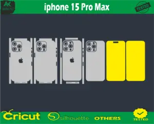
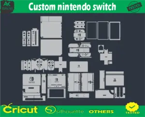
What are some examples of mobile skin templates?
DSLR template: A template for a digital camera that has a screen resolution of 480×360 pixels.
Gamepad template: A template for a gaming controller that has a screen resolution of 480×272 pixels.
iPad template: A template for a tablet that has a screen resolution of 1024×768 pixels.
Smartphone template: A template for a phone that has a screen resolution of 480×800 pixels.
iPad mini template: A template for a smaller tablet that has a screen resolution of 1024×768 pixels.